25/26 Ballet BC
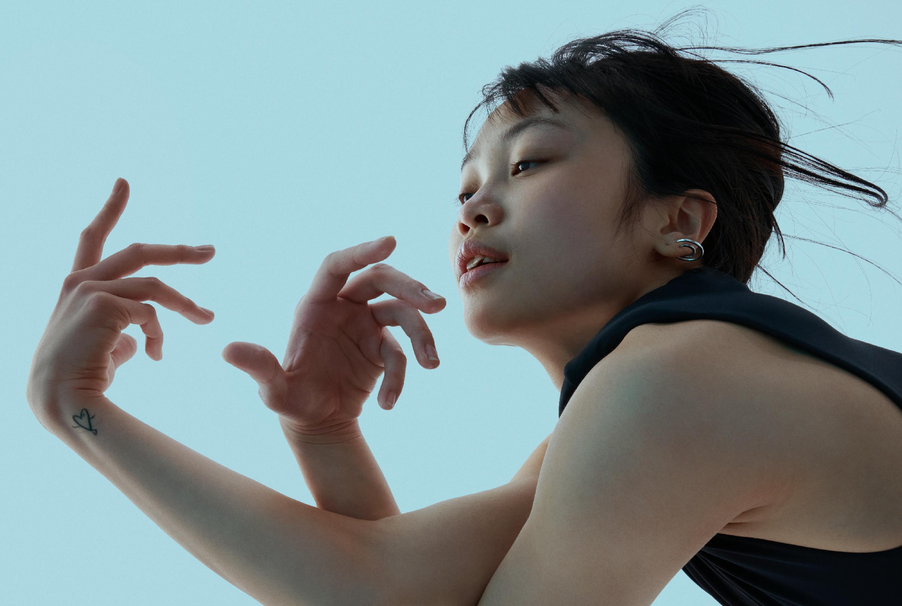
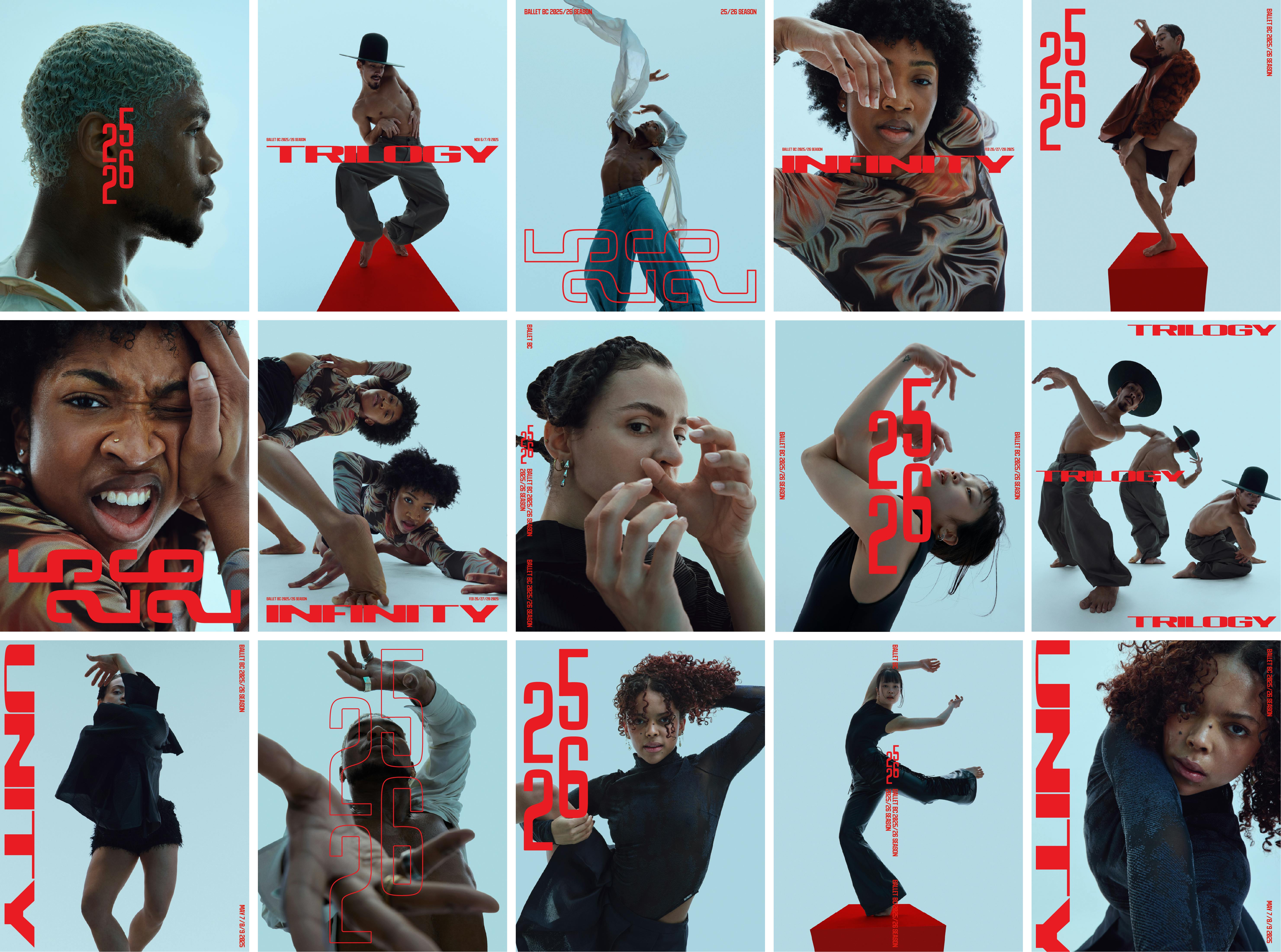
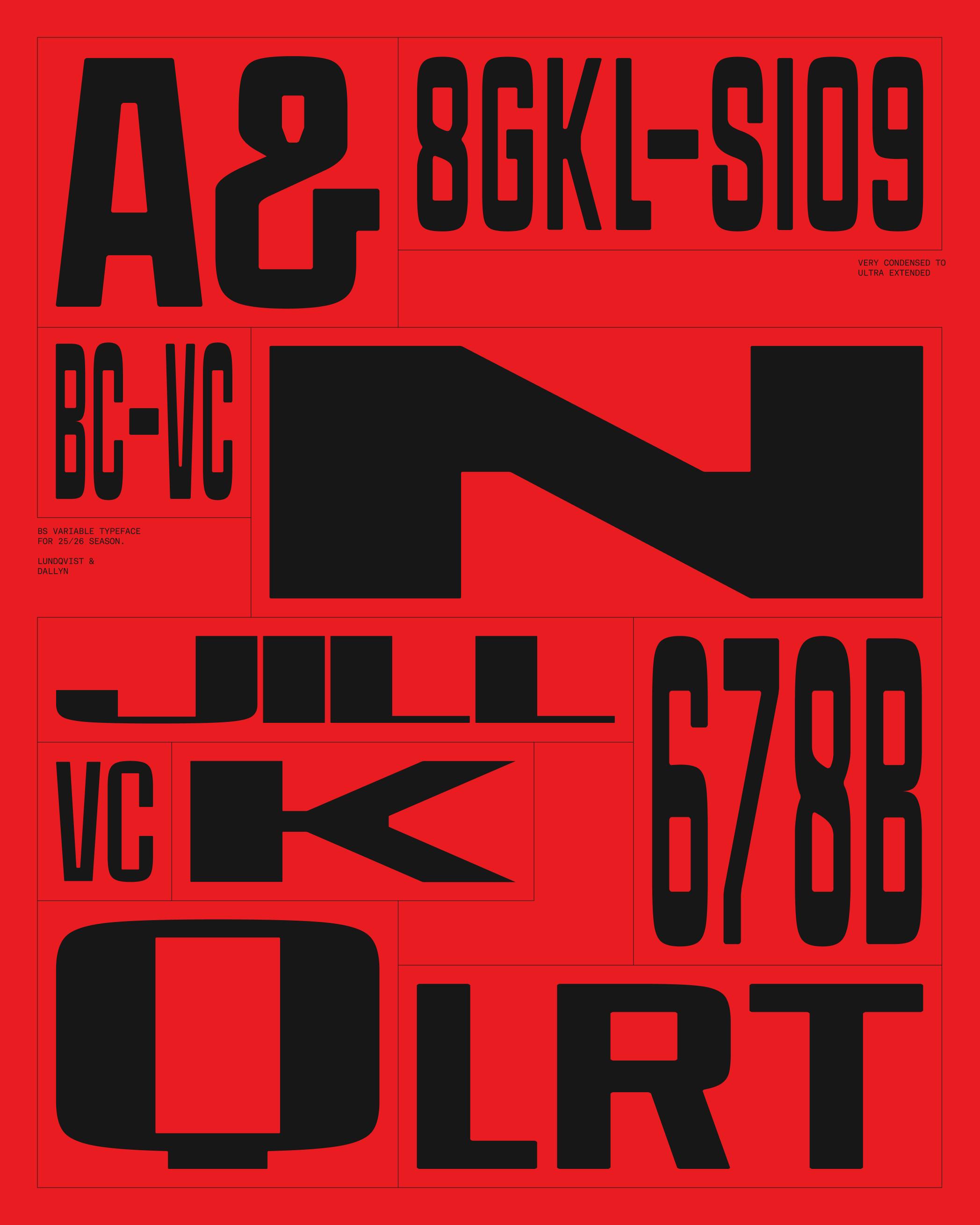
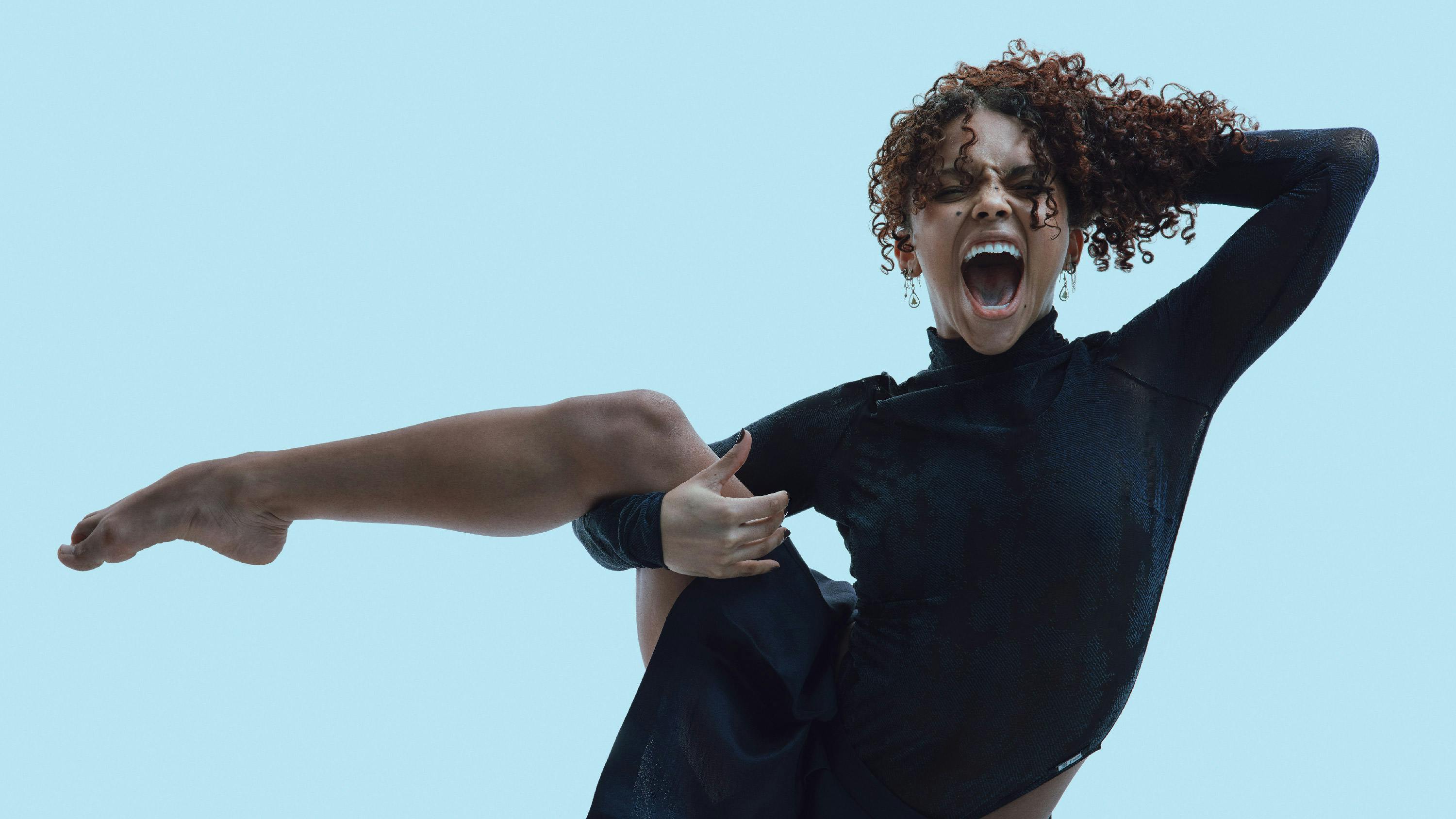
Ballet BC’s 2025 / 26 season unfolds as a seamless choreography of form and function—on stage and on the page. Our dancers defy gravity, gliding between line and curve, and our bespoke sans-serif typeface mirrors their grace—stretching, contracting and striking every arabesque and attitude. It’s typography as disciplined and dynamic as the ballet itself.

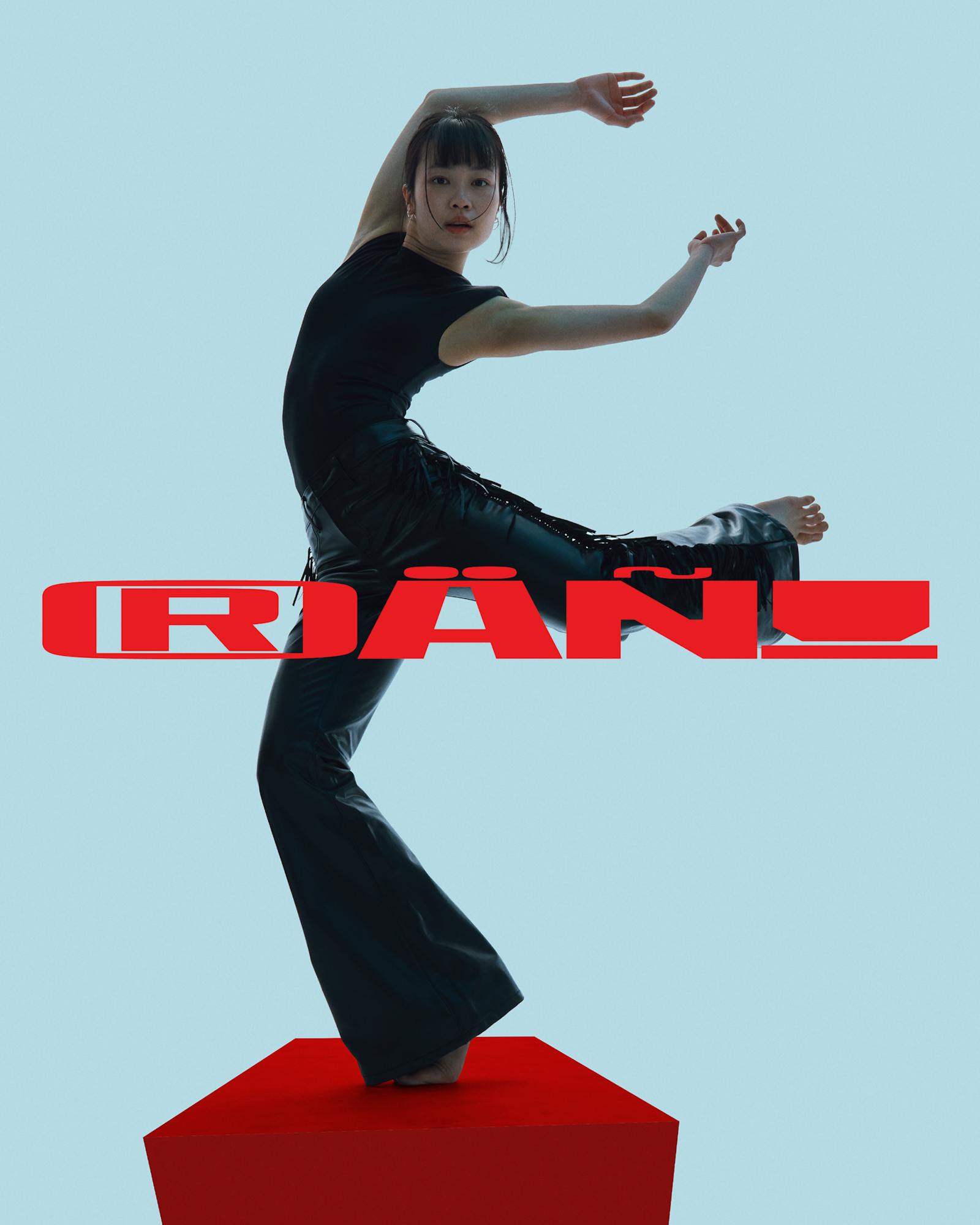
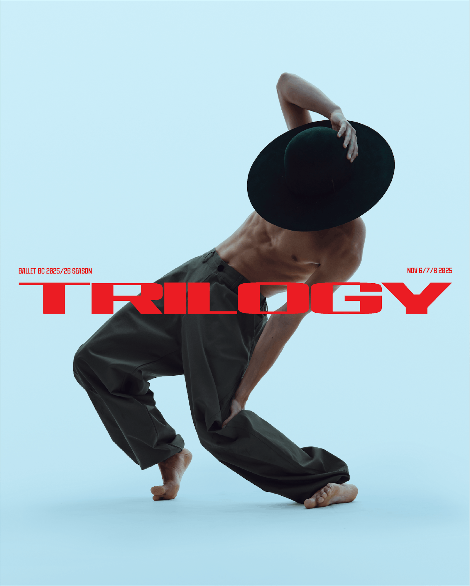
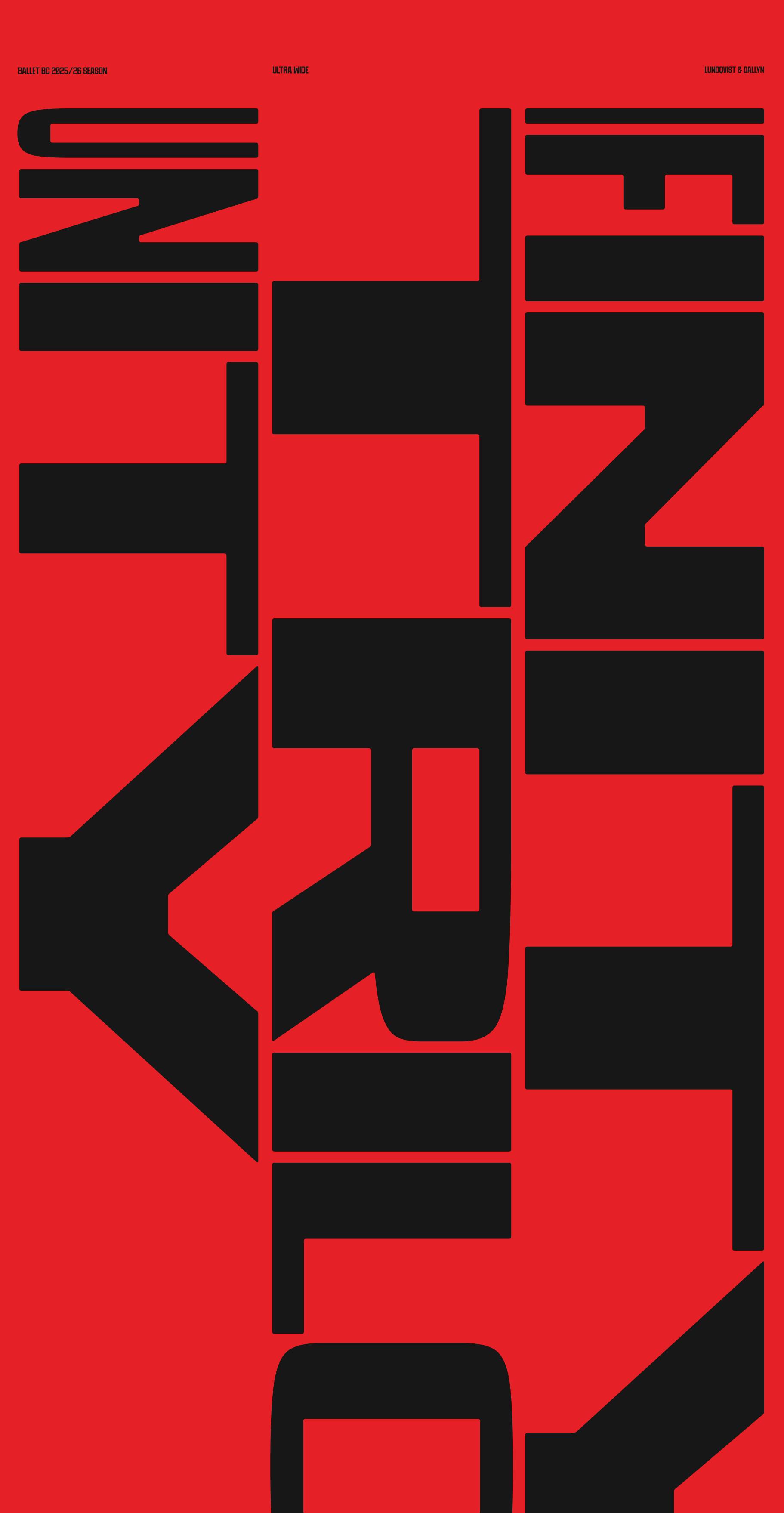
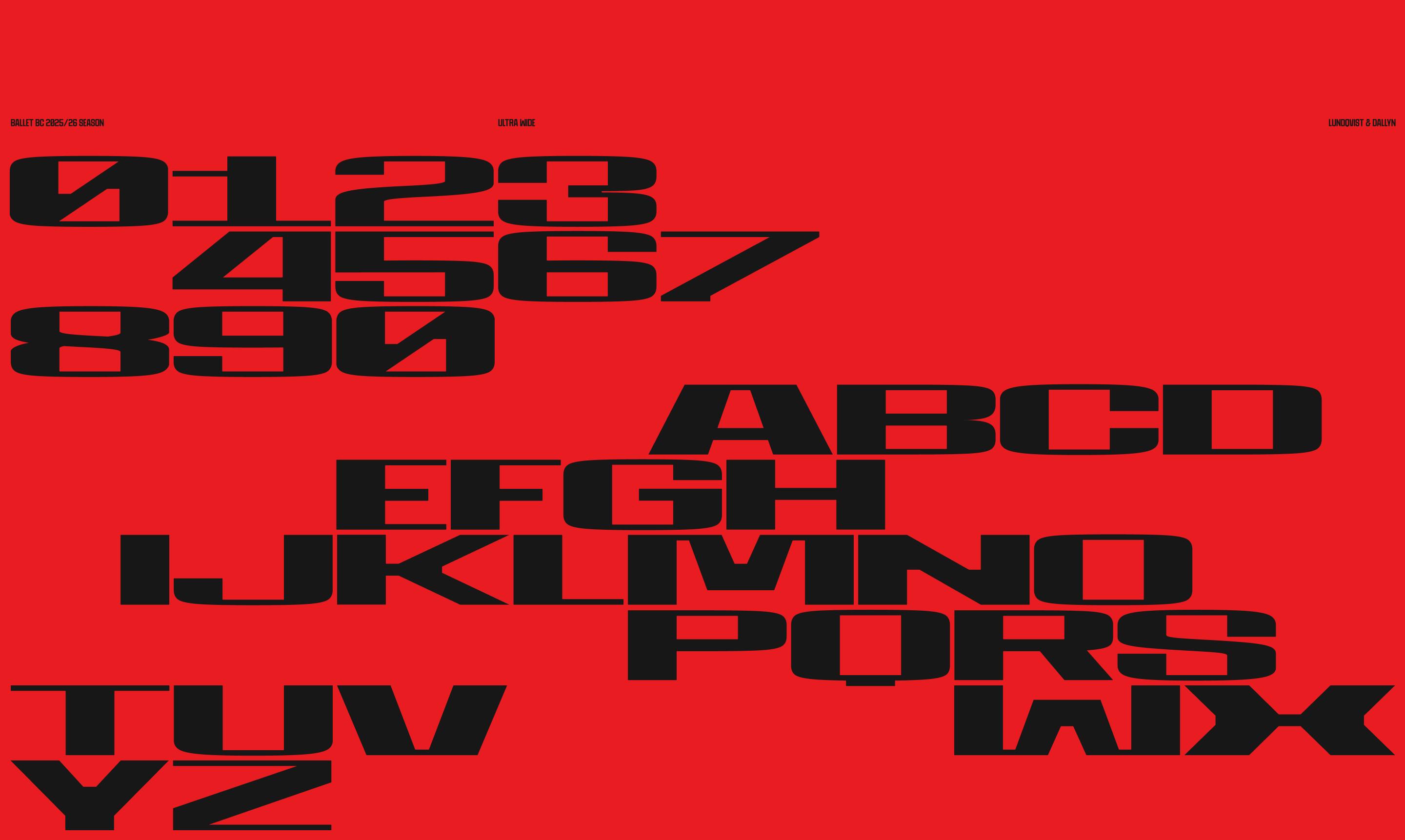
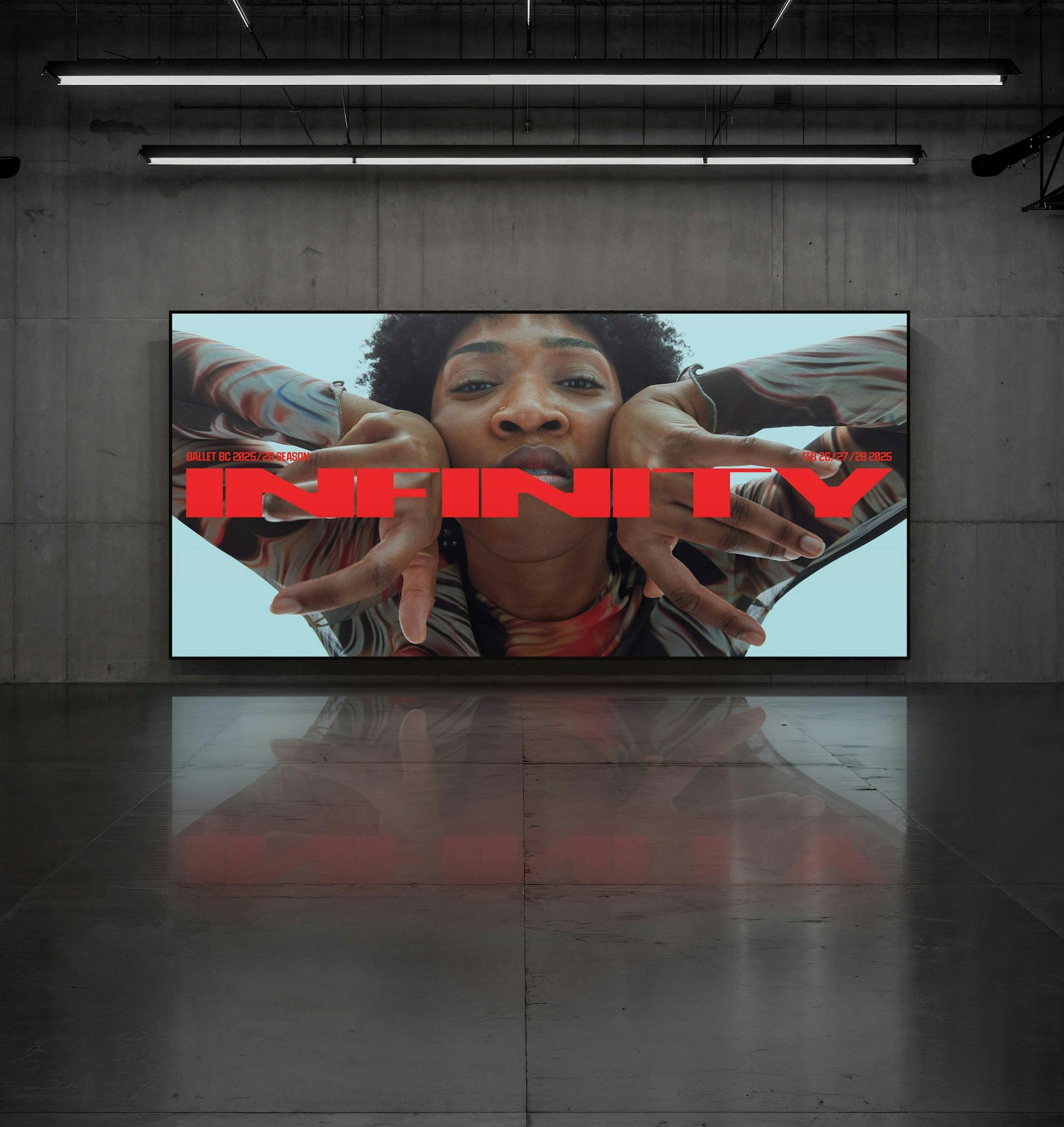
Wide, low proportions give the letters a sense of forward momentum—an echo of the balletic pas de deux, where each movement propels the next. Tight sidebearings and interlocking strokes create a continuous visual flow, just as our choreography weaves individual bodies into a cohesive ensemble. Negative spaces—those rectangular apertures in the “I” and “F,” the slanted rhombus buried in the “N”—play off the solid forms, punctuating moments of stillness amid motion.
At its heart, this is a grotesque-inspired, geometric display face reimagined for the theater. Its monolinear strokes and uniform weight mirror the dancers’ sculpted lines, while the boldly squared terminals and modular cut-outs evoke the precision of a grand jeté. You’ll recognize the stark efficiency of early sans-serifs—think Akzidenz-Grotesk’s clarity of form—fused with the kinetic energy of contemporary “techno” lettering. But unlike those classic models, this face refuses any soft curves or humanist warmth. Every element is segmented and exacting, much like the pointe shoes that shape a dancer’s slightest tilt or turn.
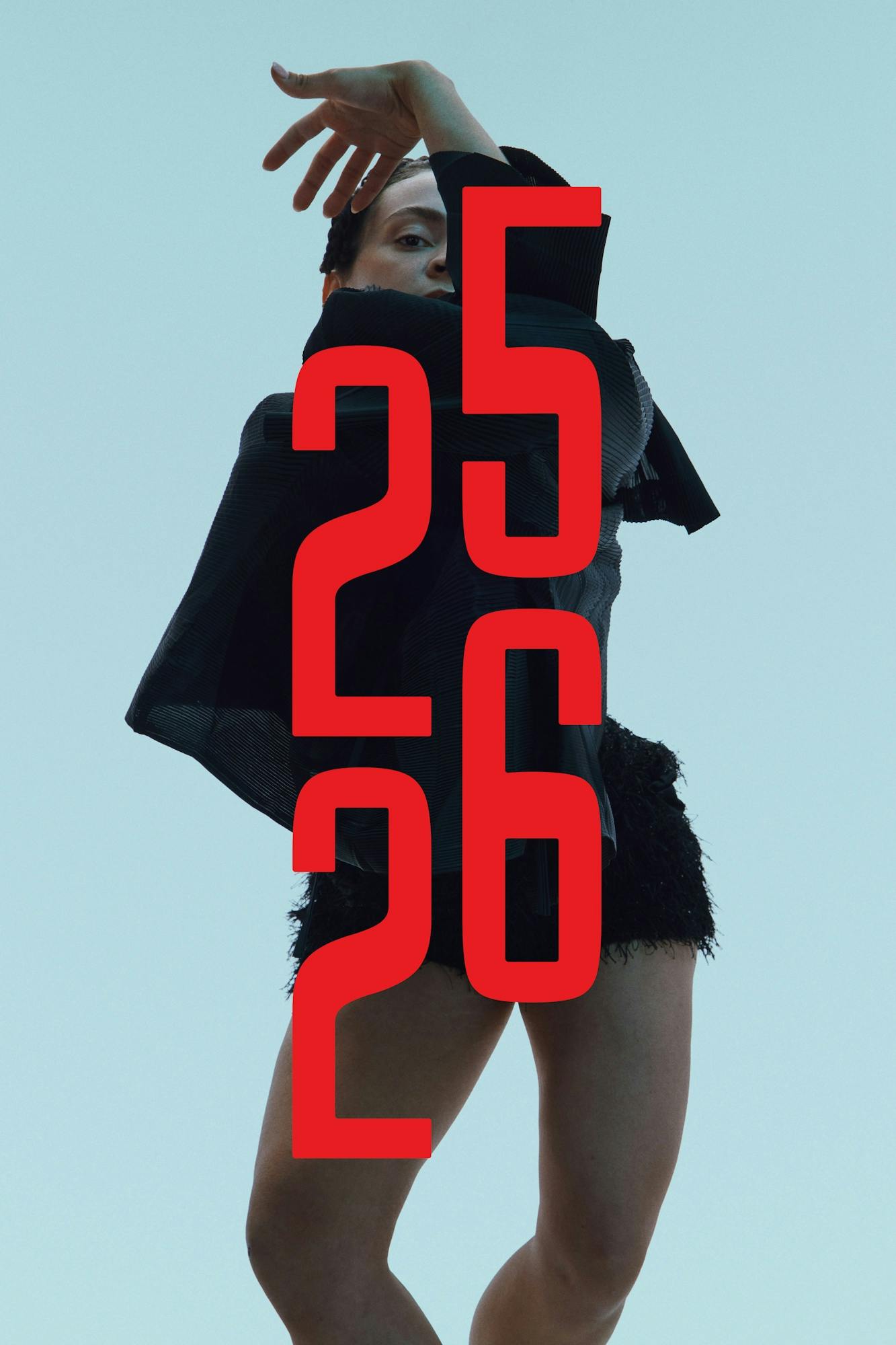
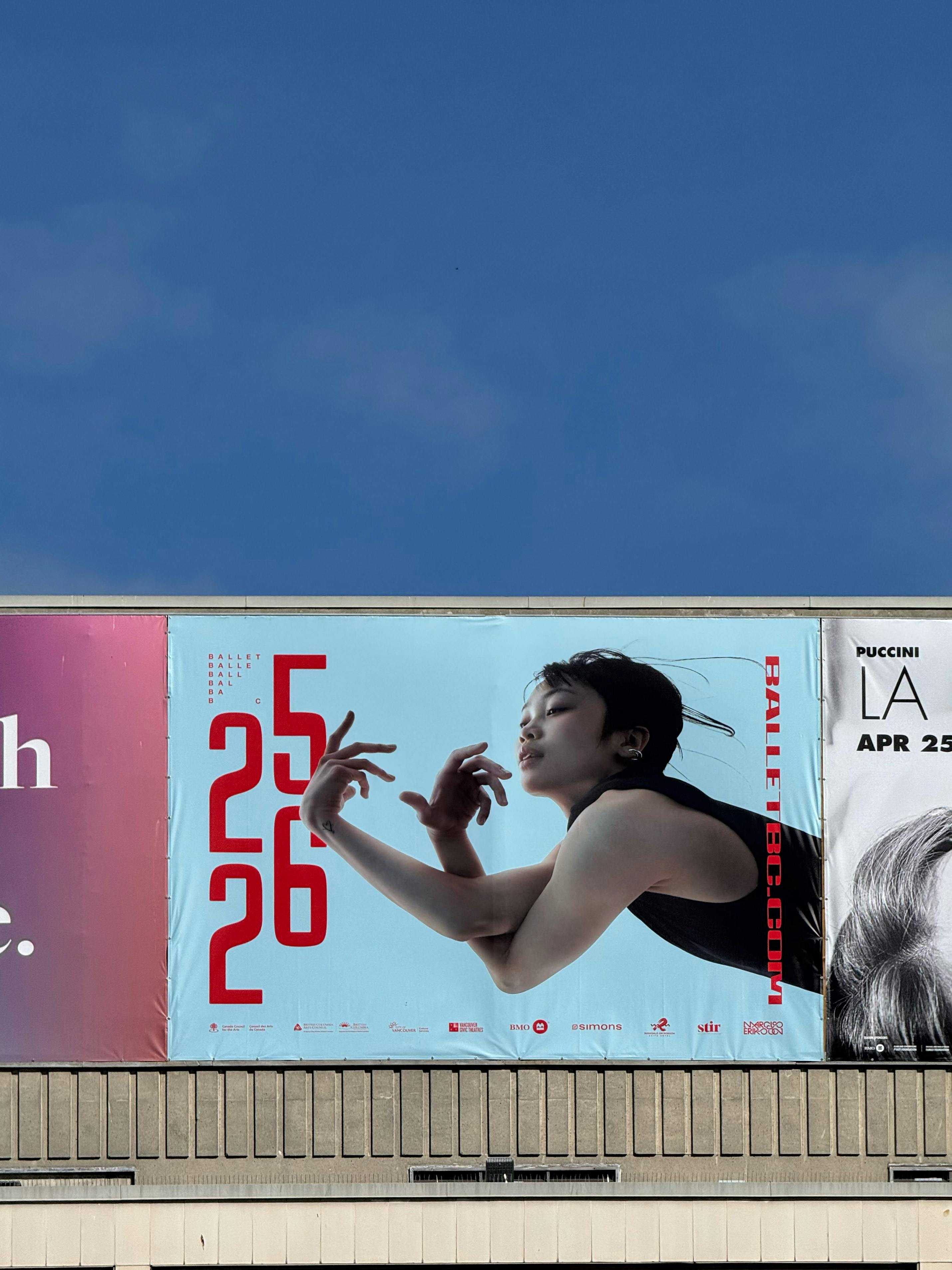
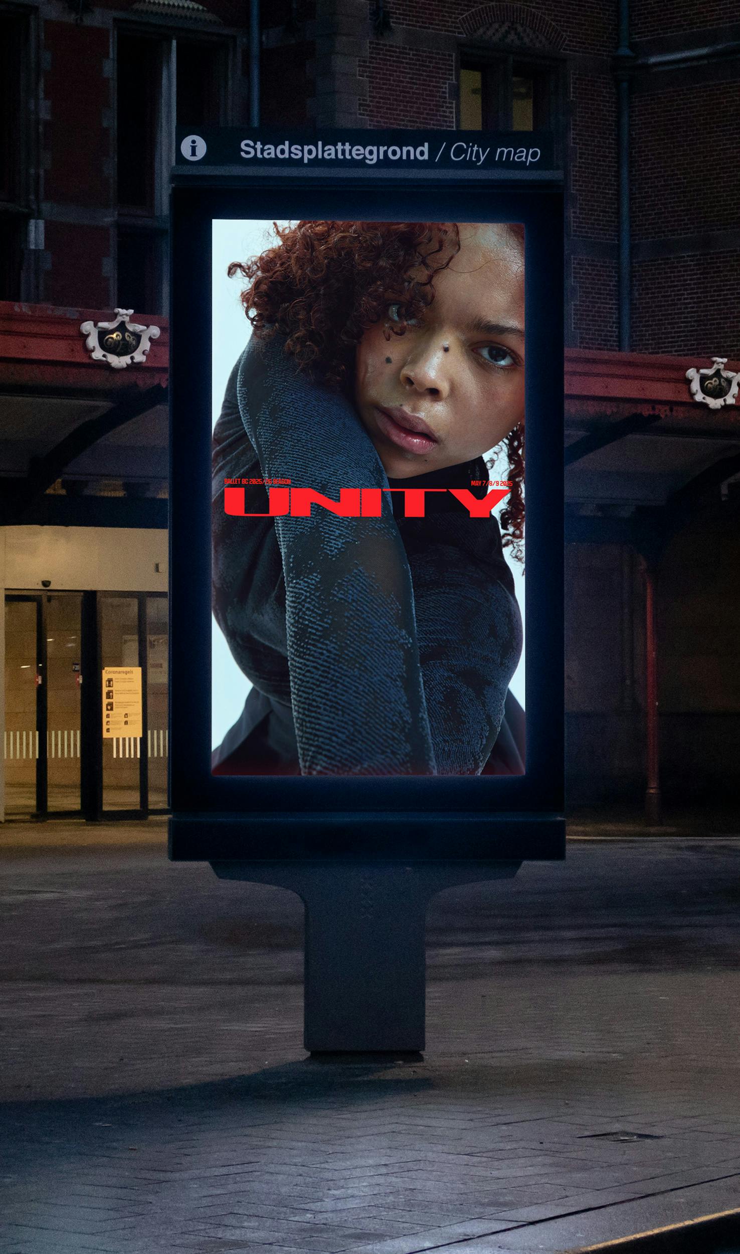
On printed programs, posters, and digital screens, this typeface becomes a partner in storytelling. It speaks with the same confidence as our dancers’ raised arms and poised gazes, and it adapts effortlessly to the varying scales of performance collateral—from bold lobby banners announcing world premieres to delicate back-page credits.
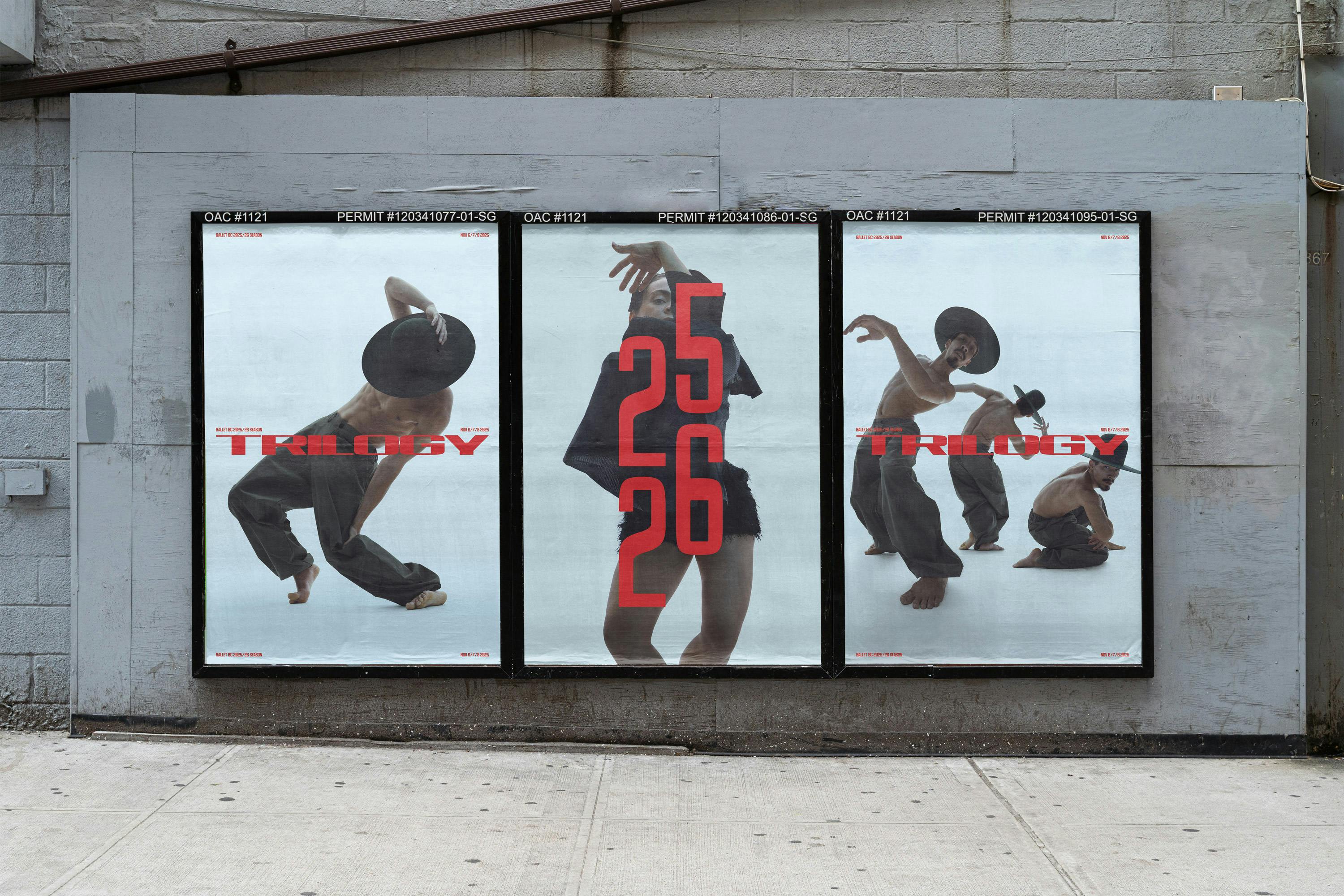
Images and Creative direction Marcus Eriksson.
Type Bits
