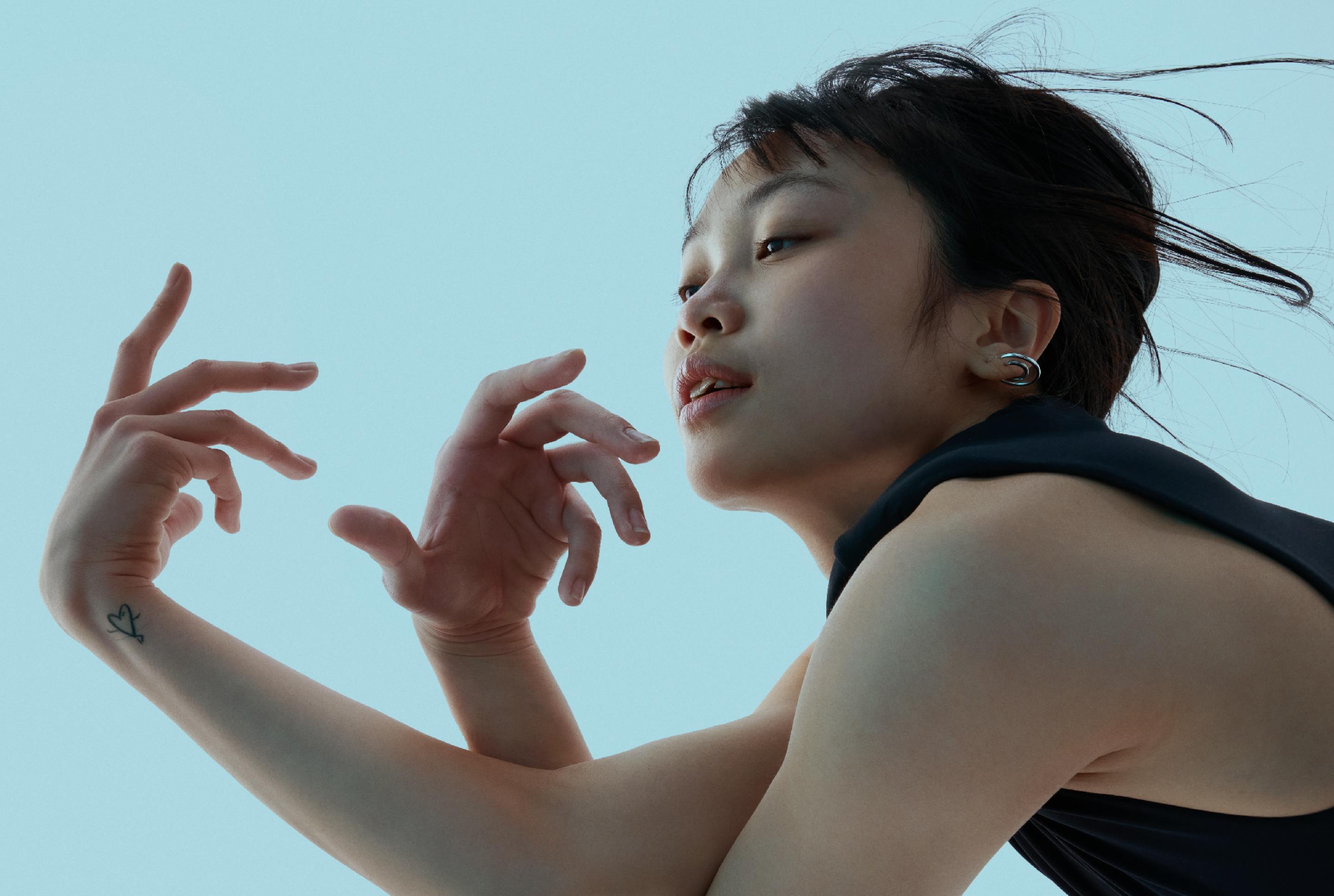
Keith Greenbaum

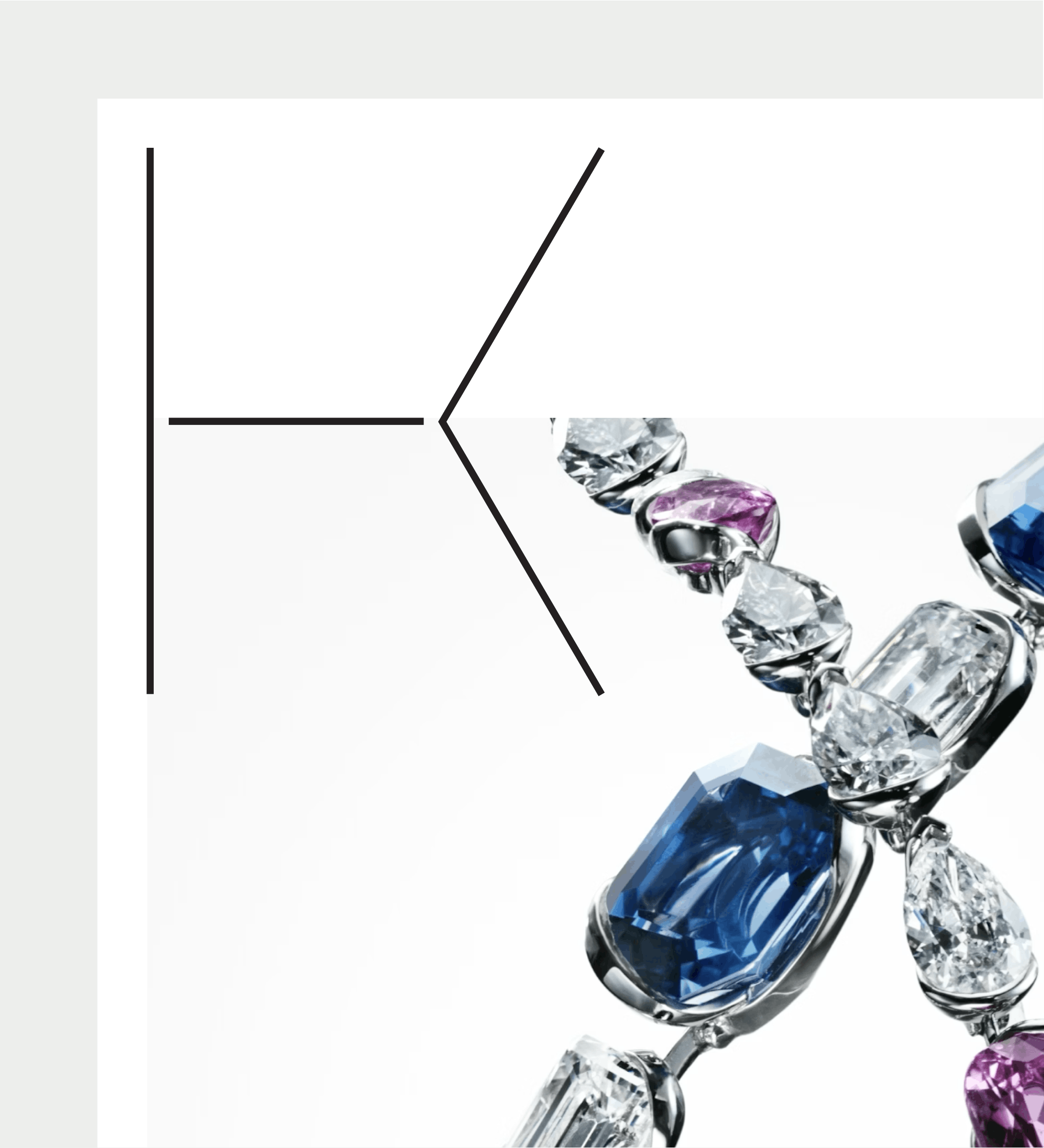
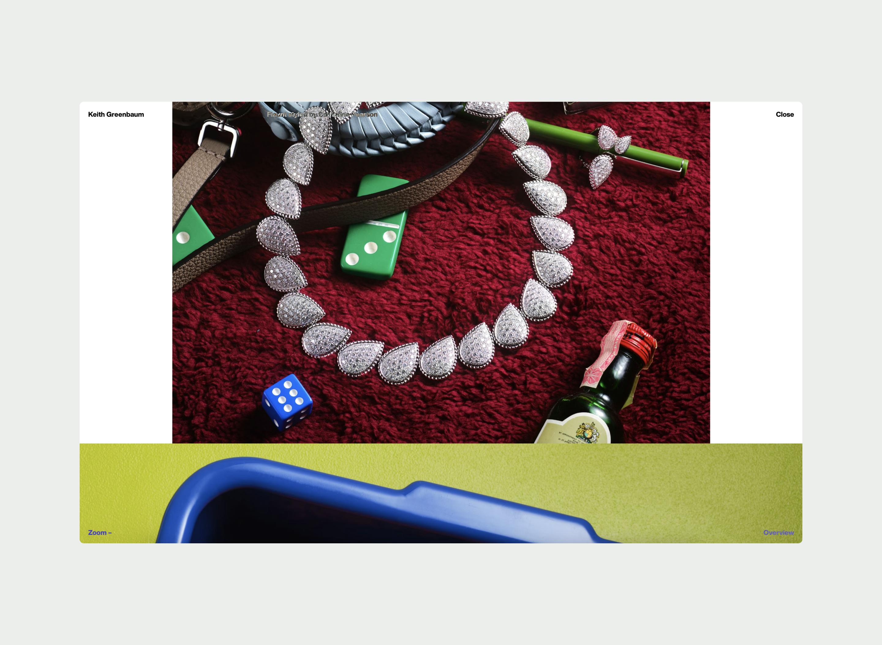
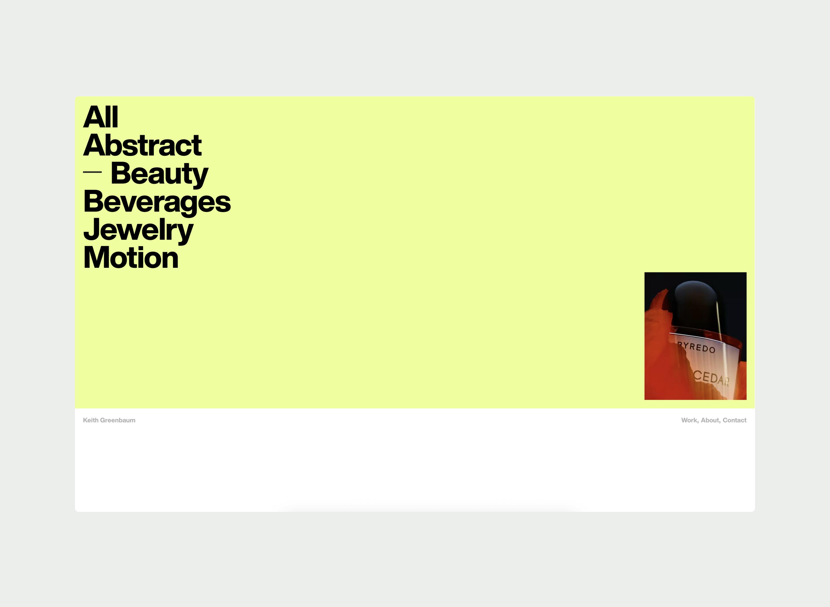
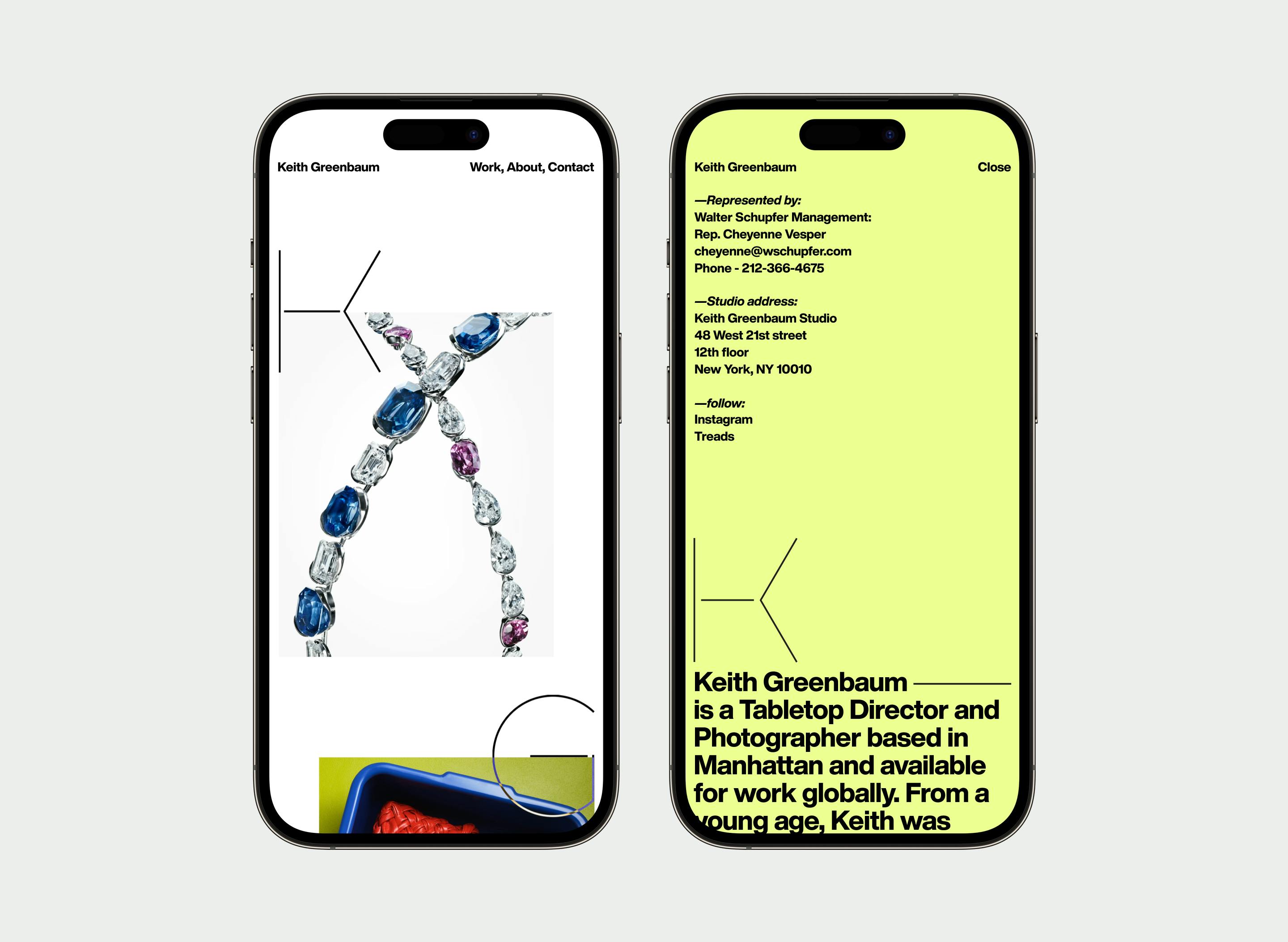
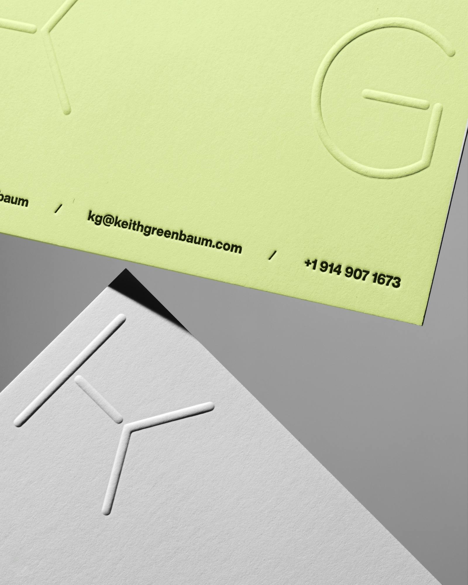
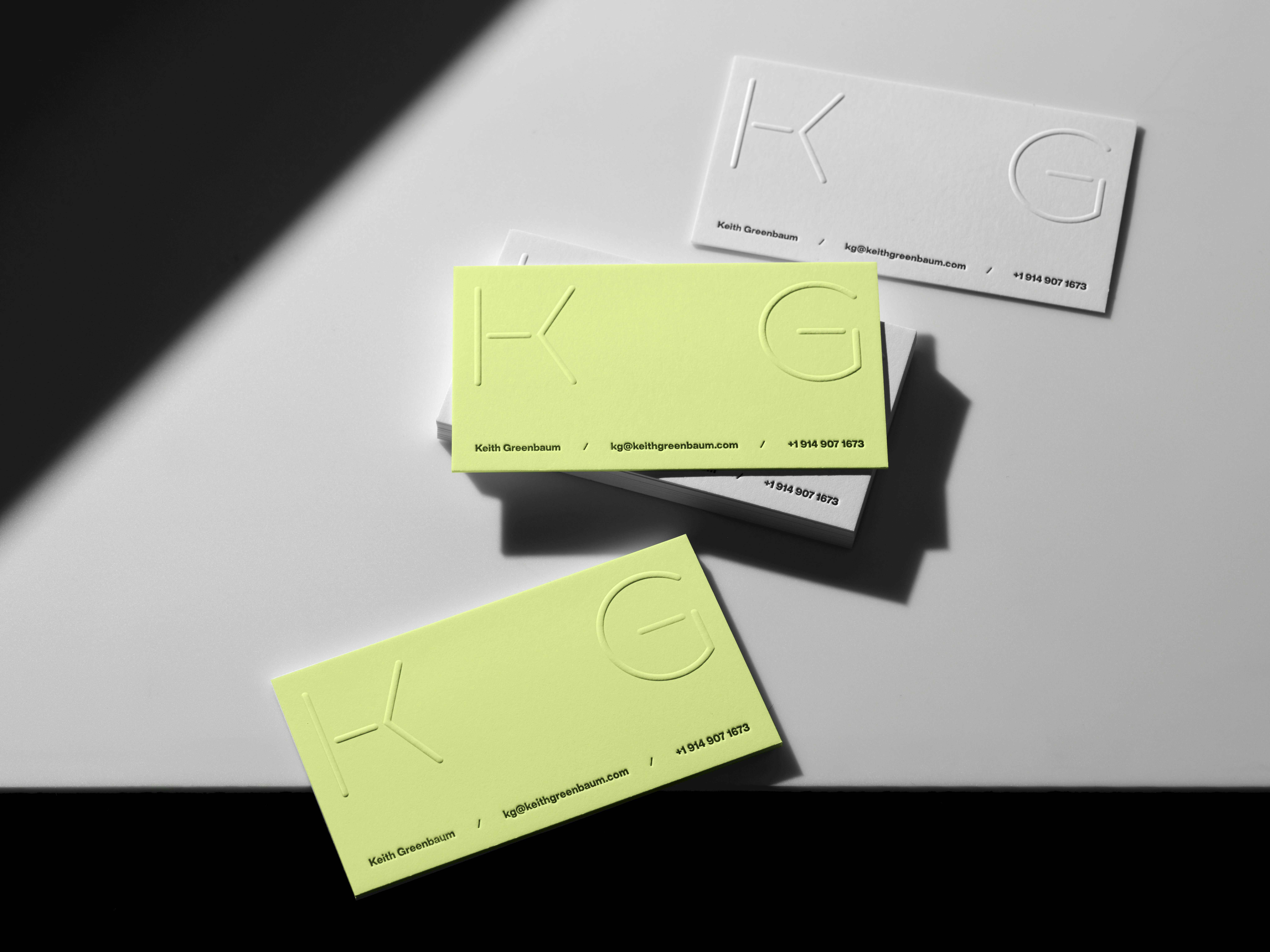
Keith Greenbaum’s new brand and website bring a quiet clarity to his work as a tabletop photographer and director. The design centers on a minimal monogram that subtly fuses his initials, built within a strict grid that mirrors the careful structure of his compositions. It’s simple and refined—just like the pristine tabletops he shoots on. The white space and clean layout keep the focus on the photography, while a clever nod appears in the thin horizontal lines throughout the site, echoing the surfaces and edges of the tables where much of his work takes shape.
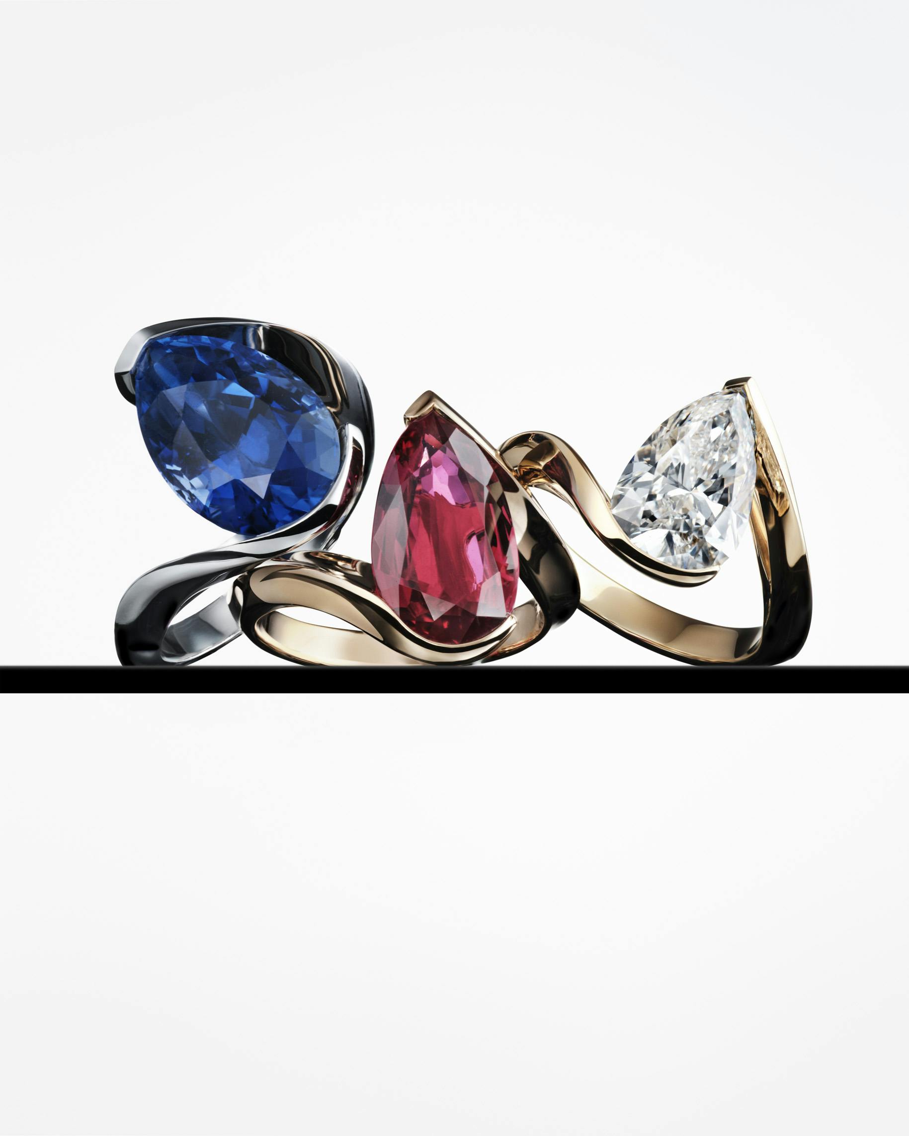
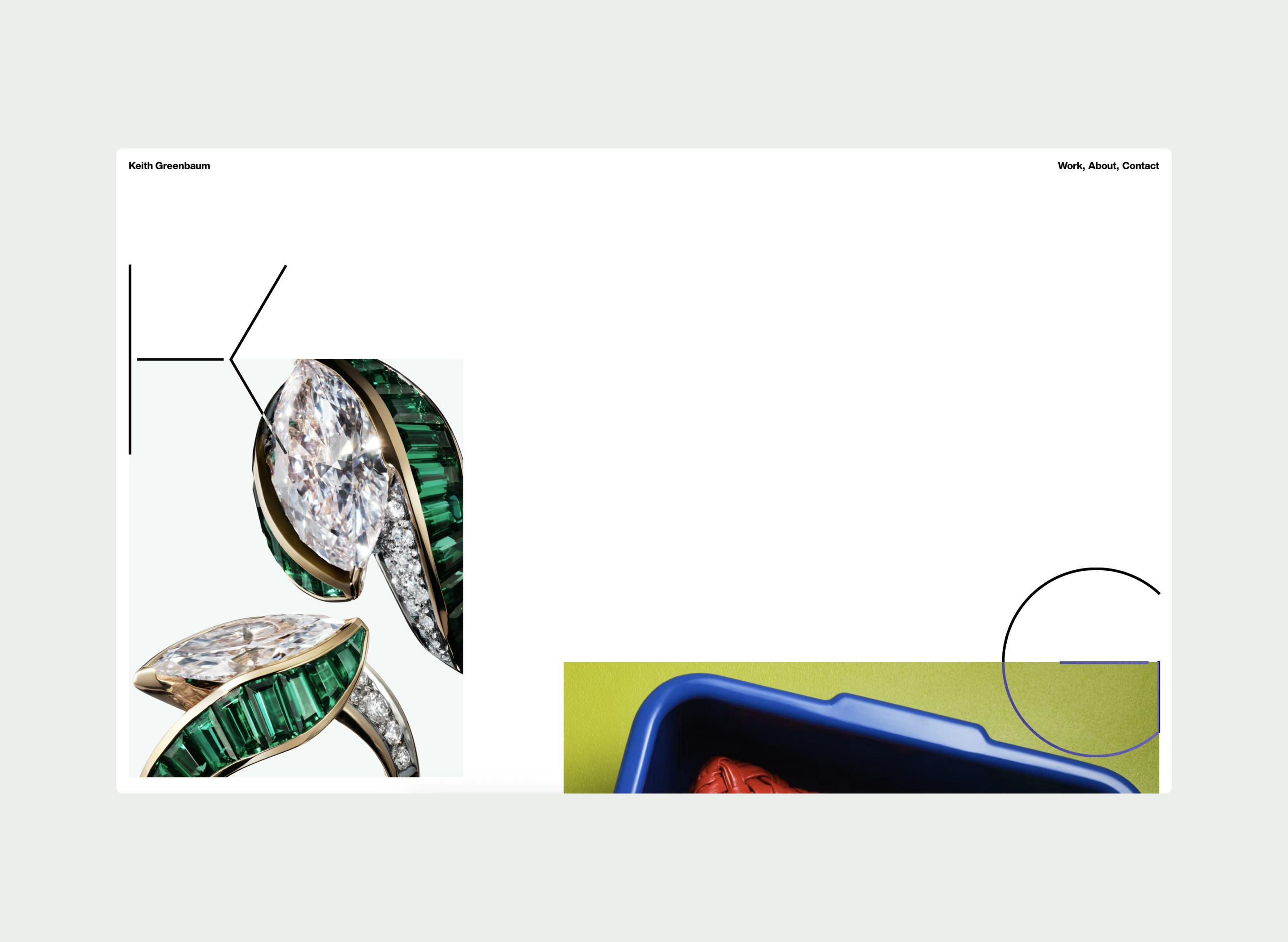
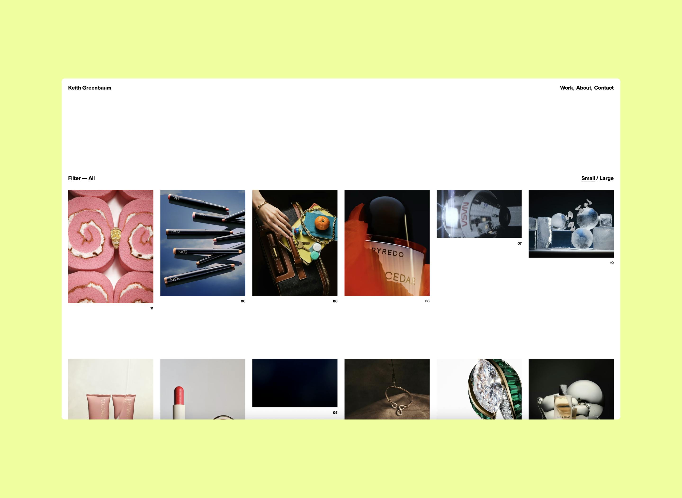
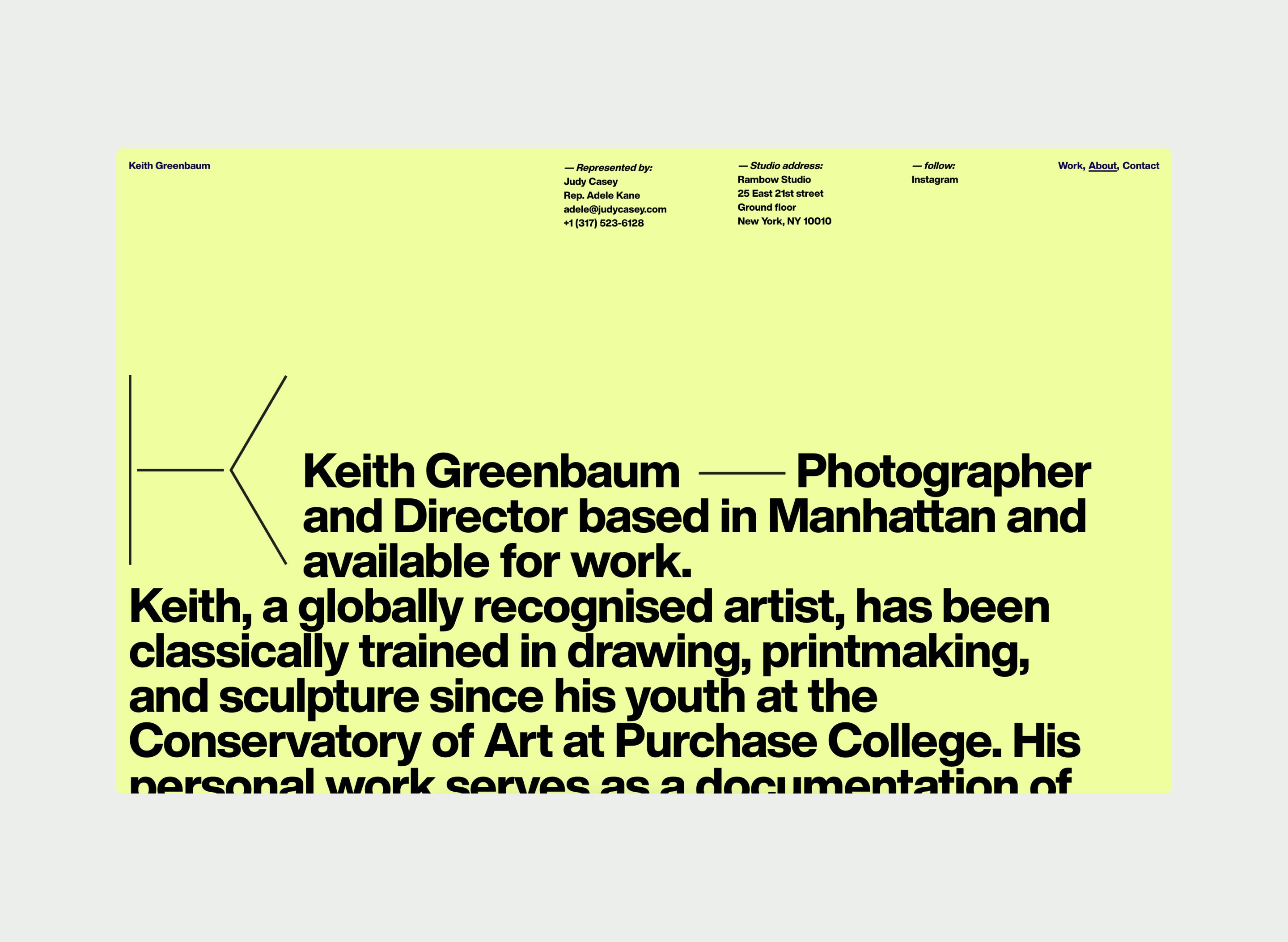
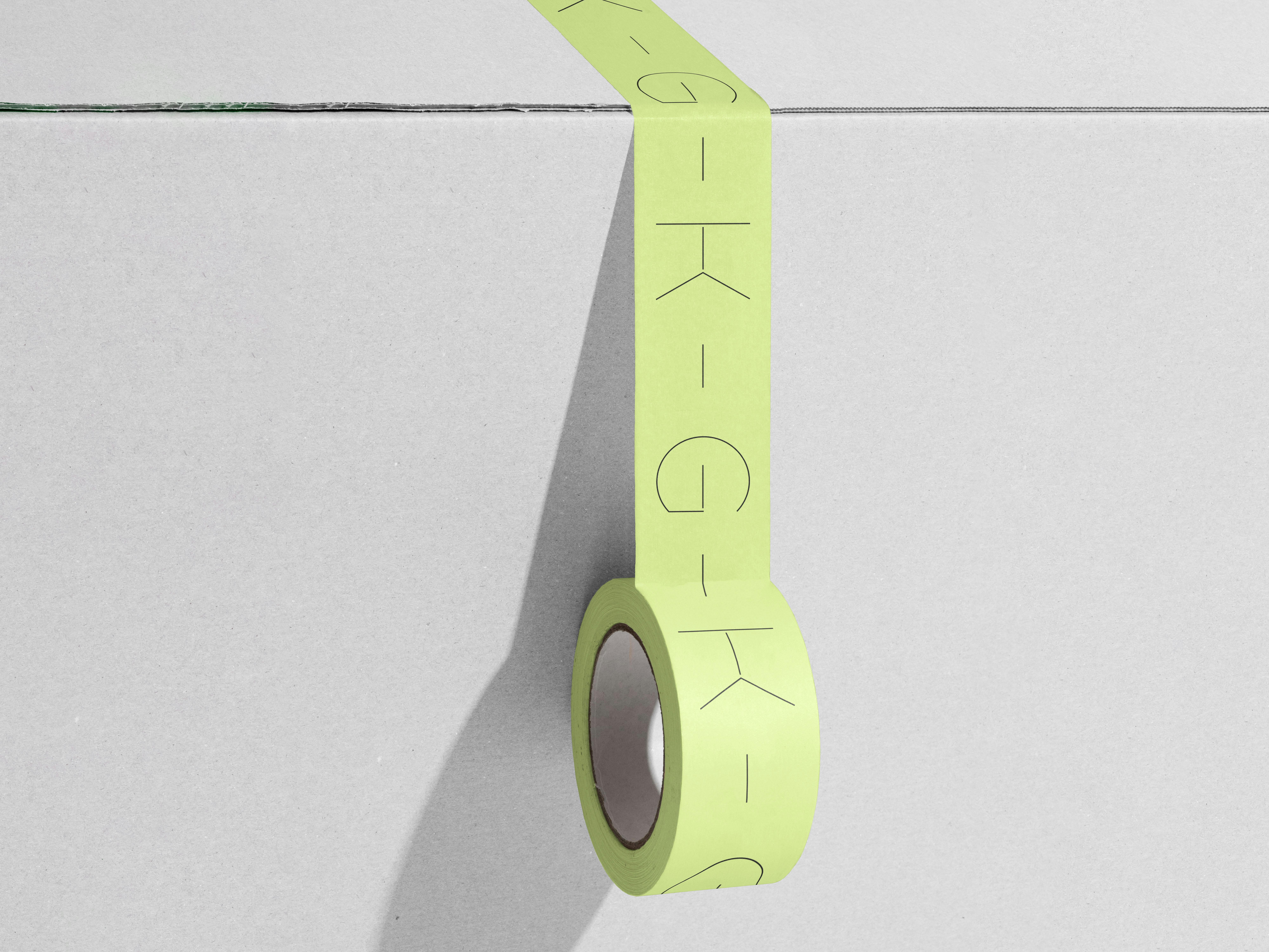
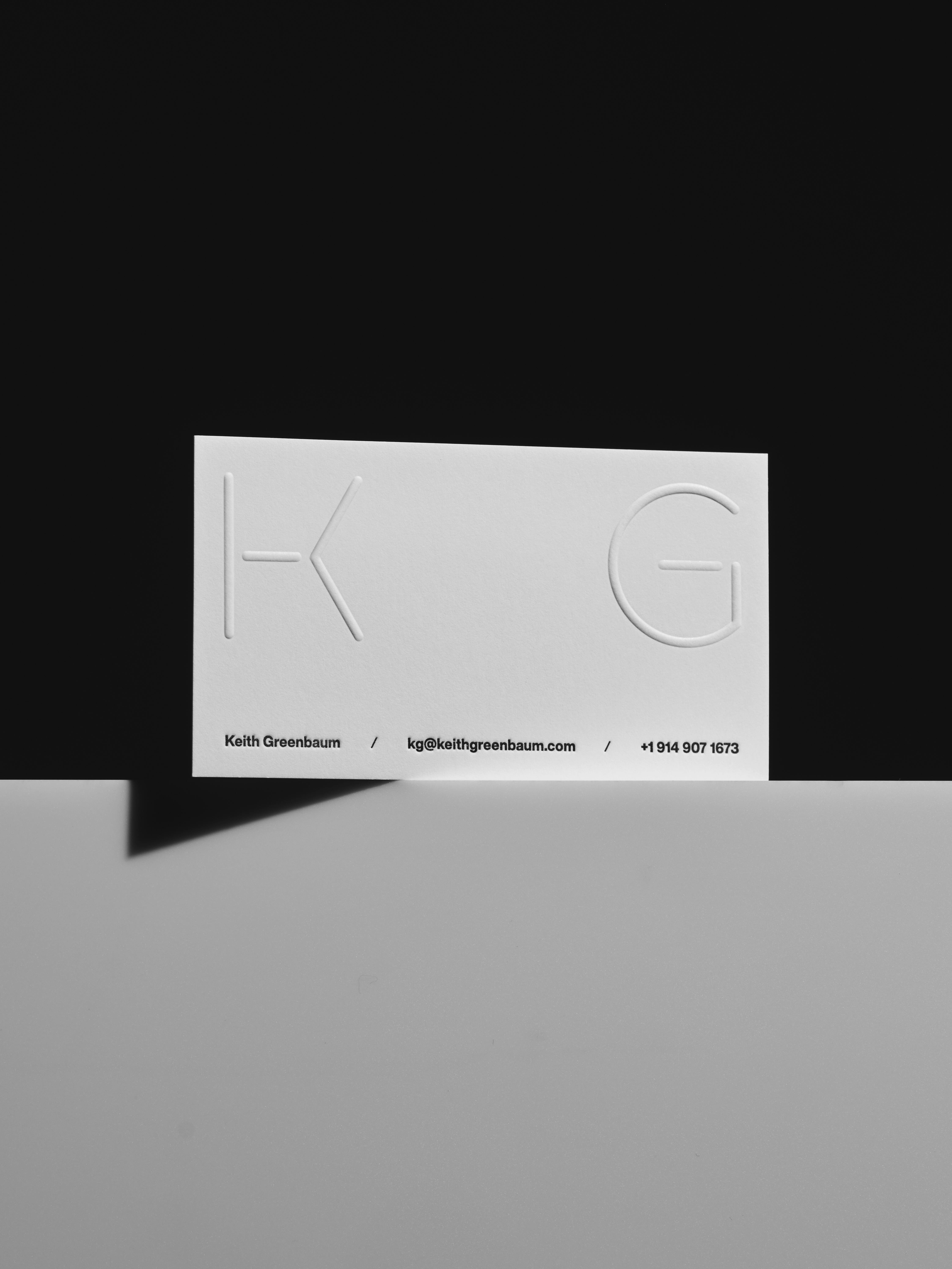
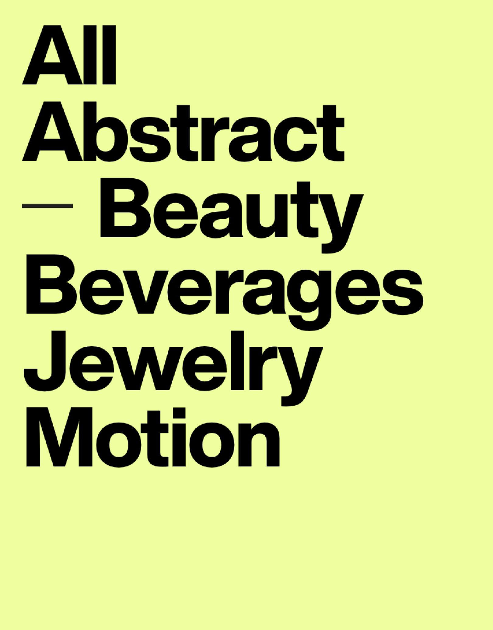
There’s a calm confidence in the way the brand comes together. It doesn’t shout, but it says exactly what it needs to: thoughtful, precise, and deeply considered. The typography is sharp, the palette restrained, and everything feels in its right place—just like Keith’s images. More than just a portfolio, the new identity feels like a natural extension of his process: minimal, intentional, and unmistakably his.

25/26 Ballet BC
